#Design System
#Design System
#Design System
#Adoption
#Adoption
#Adoption
#Tokenization
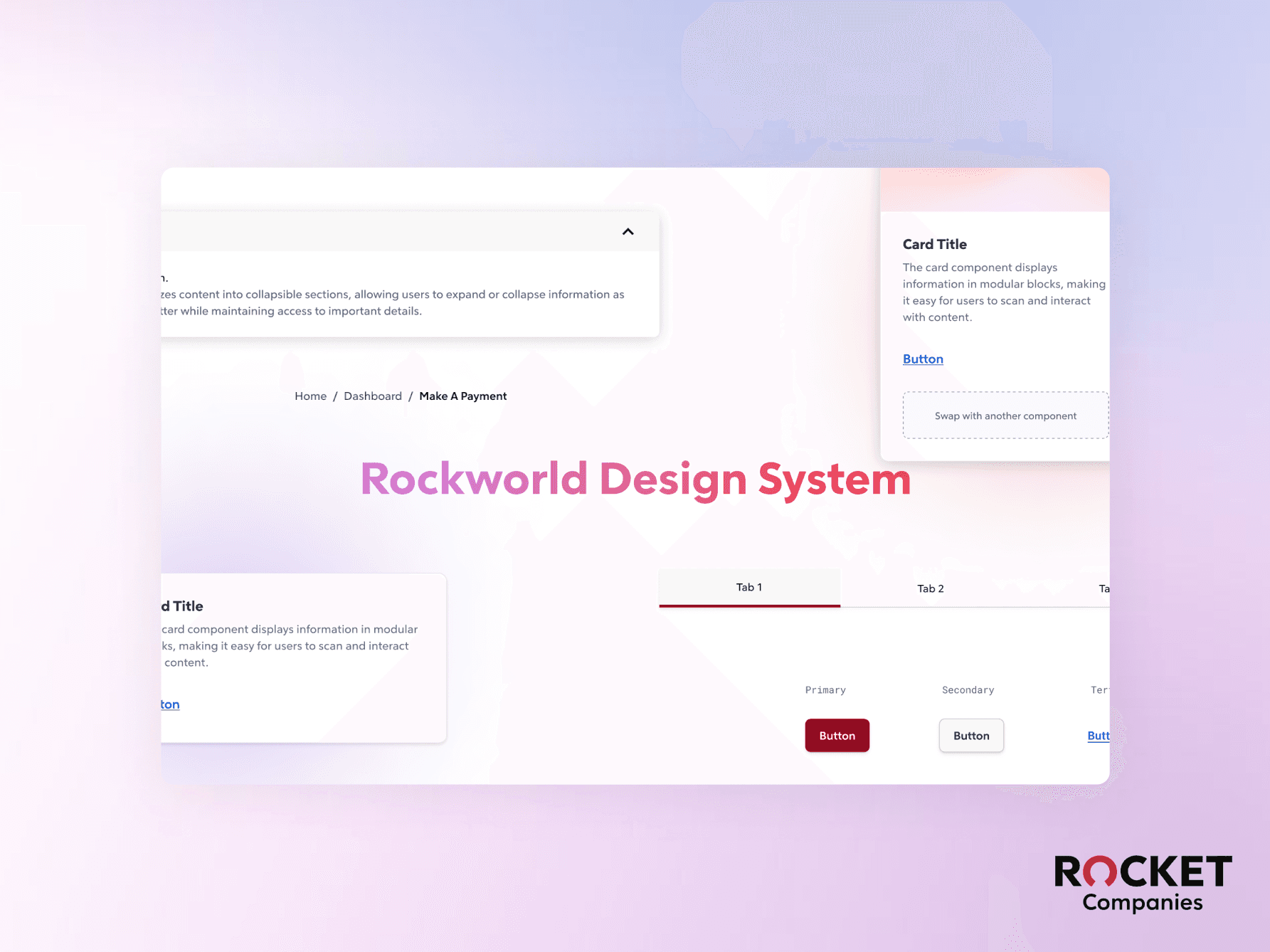
Rockworld Design System
Rockworld Design System
Rockworld Design System
Rockworld Design System
Rockworld Design System
Rockworld Design System
TL; DR
PROBLEM
The existing customer-facing design system lacked support for internal platforms.
Enterprise Product teams had to build from scratch, causing inconsistencies, delays, and high development effort.
SOLUTION
I took the initiative to design a scalable, token-driven, and variant-supported design system with 20+ reusable components, enabling modern theming (e.g., light/dark mode).
I led adoption workshops, aligning cross-functional stakeholders, educating teams, and establishing a single source of truth for internal UI standards.
I collaborated with engineering to ensure seamless integration with Bootstrap 4, currently in development.
TL; DR
PROBLEM
The existing customer-facing design system lacked support for internal platforms.
Enterprise Product teams had to build from scratch, causing inconsistencies, delays, and high development effort.
Solution
I took the initiative to design a scalable, token-driven, and variant-supported design system with 20+ reusable components, enabling modern theming (e.g., light/dark mode).
I led adoption workshops, aligning cross-functional stakeholders, educating teams, and establishing a single source of truth for internal UI standards.
I collaborated with engineering to ensure seamless integration with Bootstrap 4, currently in development.
👩💻 My Role: Design System Designer @ Rocket Companies
👩💻 My Role: Design System Designer @ Rocket Companies
Accessibility Audit, Prioritization (Roadmap Planning), Tokenization, Prototyping, User Testing, Survey & Interview (Stakeholder Interview), Component /Template Design, Documentation
Accessibility Audit, Prioritization (Roadmap Planning), Tokenization, Prototyping, User Testing, Survey & Interview (Stakeholder Interview), Component /Template Design, Documentation
👥 Team
👥 Team
1 Product Designer
1 Design System Designer (Me)
1 Front-end Developer
1 Product Designer
1 Design System Designer (Me)
1 Front-end Developer
🕑 Duration
🕑 Duration
July - Nov 2024 (5 Months)
July - Nov 2024 (5 Months)
TL; DR
PROBLEM
The existing customer-facing design system lacked support for internal platforms.
Enterprise Product teams had to build from scratch, causing inconsistencies, delays, and high development effort.
Solution
I took the initiative to design a scalable, token-driven, and variant-supported design system with 20+ reusable components, enabling modern theming (e.g., light/dark mode).
I led adoption workshops, aligning cross-functional stakeholders, educating teams, and establishing a single source of truth for internal UI standards.
I collaborated with engineering to ensure seamless integration with Bootstrap 4, currently in development.
OUTCOME
OUTCOME
Component-level Integration with the Rocket Design Foundation.
Component-level Integration with the Rocket Design Foundation.
Redesigned component properties to support flexible customization and reusability.
Designed theme-switching functionality for a seamless dark and light mode experience.
Created tokenize colors and spacing to ensure a cohesive brand experience.
Created comprehensive documentation to improve developer adoption and reduce onboarding time.


IMPACT
IMPACT
I built the Rockworld Design System as a scalable foundation, driving product consistency and efficiency. It streamlined workflows, accelerated development, and delivered measurable ROI using the KnapSnack calculator.
I built the Rockworld Design System as a scalable foundation, driving product consistency and efficiency. It streamlined workflows, accelerated development, and delivered measurable ROI using the KnapSnack calculator.
Design System
Design System
24
24
Components
Components
100%
100%
ADA & WCAG
ADA & WCAG
Business Value
Business Value
52.5%
52.5%
Return of Investment
Return of Investment
70%
70%
Design & Dev faster
Design & Dev faster
1
Problem Identified
2
Driving Stakeholder Adoption
3
Execution & Implementation
SO HOW IT STARTED
SO HOW IT STARTED
A Bloated, Unscalable System
Slowing Down Delivery
A Bloated, Unscalable System
Slowing Down Delivery
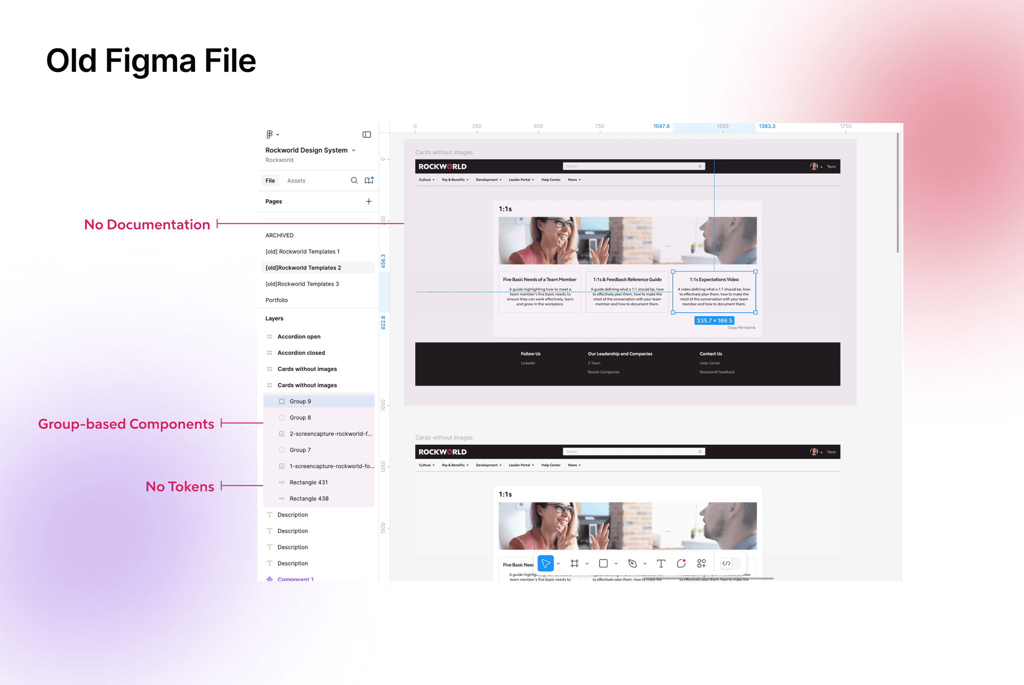
When I joined Rocket Companies, I inherited a bloated, undocumented Figma file. At the time, only one designer was using it. However, when that designer was transferred to another team, the system collapsed under broader use.
Why It Was a Problem:
Slower product delivery—teams were building UI elements from scratch instead of reusing components.
Lack of governance—without prioritization, the system couldn't scale effectively.
Inconsistent UX—every designer and developer had a different interpretation of the UI.
KEY CHALLENGES I IDENTIFIED
KEY CHALLENGES I IDENTIFIED
🙅
🙅
Stakeholders Resistance to Change
Stakeholders Resistance to Change
🫠
🫠
Lack of a Scalable Framework for Internal Use
Lack of a Scalable Framework for Internal Use
CONTEXT
CONTEXT
Rockworld is an internal enterprise platform used by 10,000+ employees across Rocket companies.
Rockworld is an internal enterprise platform used by 10,000+ employees across Rocket companies.
Within two months, the number of product designers using the system jumped from 1 to 7.
The platform contained 200+ pages, but lacked consistency and scalability.
Developers often had to build components from scratch, causing significant delays and misalignment.
Within two months, the number of product designers using the system jumped from 1 to 7.
The platform contained 200+ pages, but lacked consistency and scalability.
Developers often had to build components from scratch, causing significant delays and misalignment.
Problem Identified
2
Driving Stakeholder Adoption
3
Execution & Implementation
CHALLENGE 01
CHALLENGE 01
Stakeholders Resistance to Change
Stakeholders Resistance to Change
HOW I DEAL WITH THIS SITUATION
HOW I DEAL WITH THIS SITUATION
Step-by-Step: How I Overcame Stakeholder Pushback
Step-by-Step: How I Overcame Stakeholder Pushback
1
Stakeholder Interviews → Uncovering Pushback
Identified resistance through interviews and proposed a phased solution.
2
Securing Buy-in → Aligning on a Roadmap
Held a workshop to gain stakeholder agreement and start with a small, scalable rollout.
3
Prioritization → Defining Key Components
Identified the most critical components to build first, ensuring early impact.
Stakeholder Interviews → Uncovering Pushback
Stakeholder Interviews → Uncovering Pushback
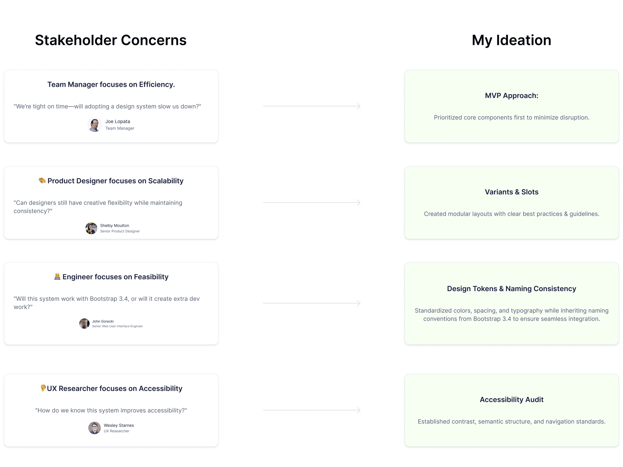
I conducted interviews with designers, developers, researchers, and leadership to uncover pain points, address concerns, and align on key priorities for adoption.
I conducted interviews with designers, developers, researchers, and leadership to uncover pain points, address concerns, and align on key priorities for adoption.
Securing Buy-in → Aligning on a Roadmap
Securing Buy-in → Aligning on a Roadmap
I facilitated collaborative mapping to align stakeholders on a Minimum Viable System (MVS), prioritizing urgent issues for quick wins and faster adoption.
I facilitated collaborative mapping to align stakeholders on a Minimum Viable System (MVS), prioritizing urgent issues for quick wins and faster adoption.
❗
❗
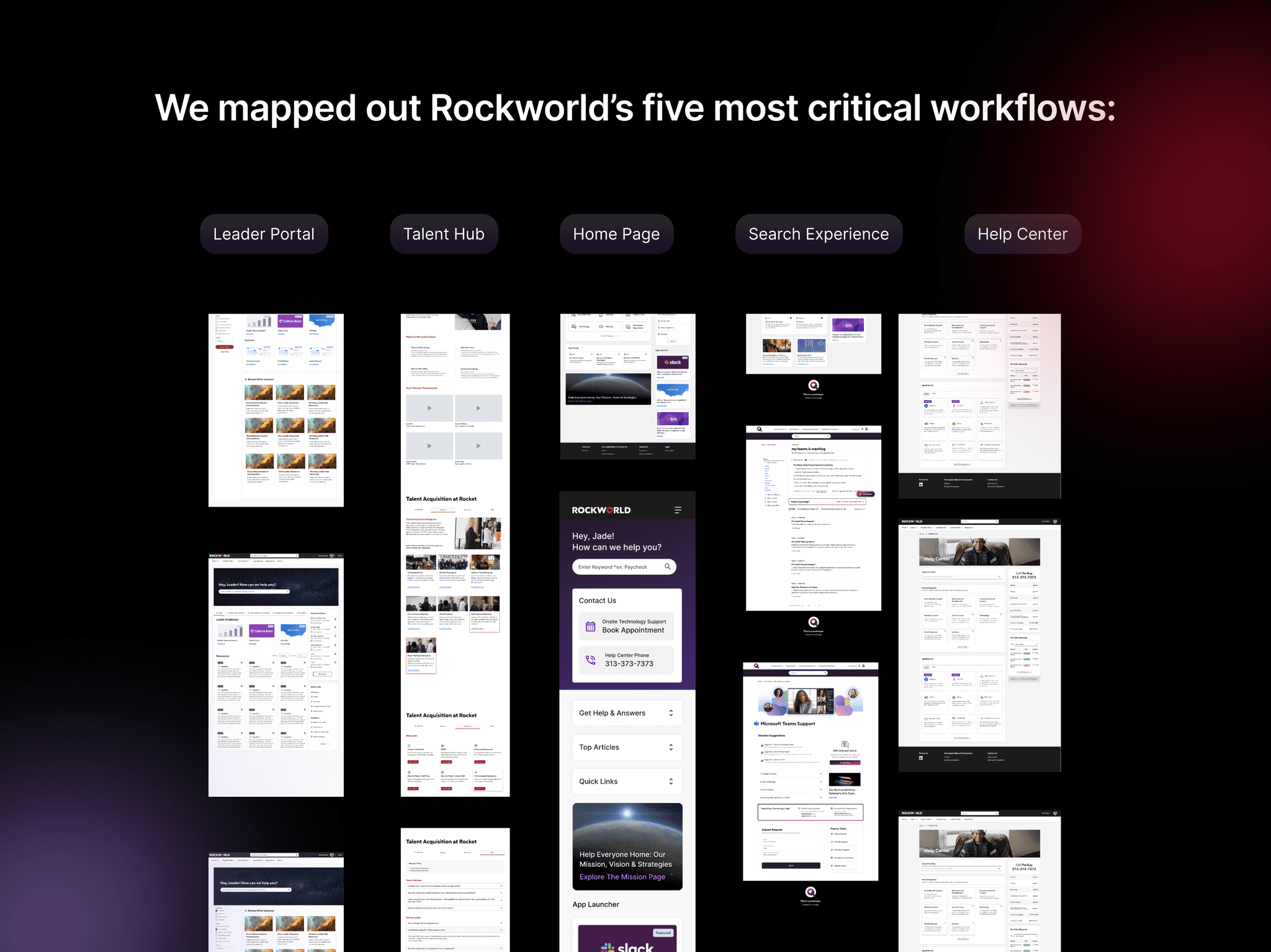
Identify the most frequently used and problematic user flows in Rockworld.
Identify the most frequently used and problematic user flows in Rockworld.
👥
👥
Align stakeholders on the priority areas for the design system to address.
Align stakeholders on the priority areas for the design system to address.
Prioritization → Defining Key Components
Prioritization → Defining Key Components
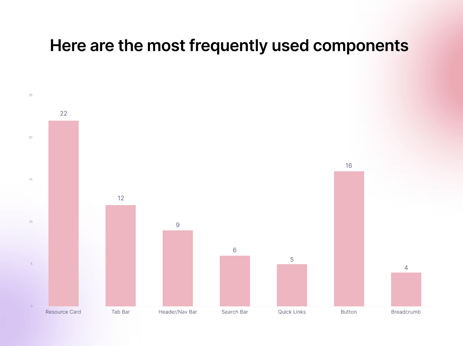
Start small: Focus on the most widely used components.
Start small: Focus on the most widely used components.
Given limited time and resources, I leveraged the company’s foundation library and built customized components for Rockworld on top of it. Through prioritization analysis, I identified Resource Cards as the most frequently used UI element, appearing 22 times across five core workflows. This made cards the logical starting point, as improving their consistency and scalability would deliver immediate and widespread impact.
Given limited time and resources, I leveraged the company’s foundation library and built customized components for Rockworld on top of it. Through prioritization analysis, I identified Resource Cards as the most frequently used UI element, appearing 22 times across five core workflows. This made cards the logical starting point, as improving their consistency and scalability would deliver immediate and widespread impact.
Problem Identified
Driving Stakeholder Adoption
3
Execution & Implementation
CHALLENGE 02
CHALLENGE 02
Lack of a Scalable Framework for Internal Use
Lack of a Scalable Framework for Internal Use
HOW I DEAL WITH THIS SITUATION
HOW I DEAL WITH THIS SITUATION
Step By Step: How I Overcame Design System Scalability Challenges
Step By Step: How I Overcame Design System Scalability Challenges
1
Design Audit (Component Audit & Accessibility Audit)
Audited the component library for inconsistencies and conducted an accessibility evaluation (WCAG) to uncover usability barriers.
2
Systematization → Tokens & Variants
Defined design tokens for light/dark mode and standardized variants, states, and interactions for scalability.
3
Documentation → A Single Source of Truth
Created Figma documentation with variants, usage guidelines, and interactive states to align designers and developers.
CURRENT FILES AUDIT
CURRENT FILES AUDIT
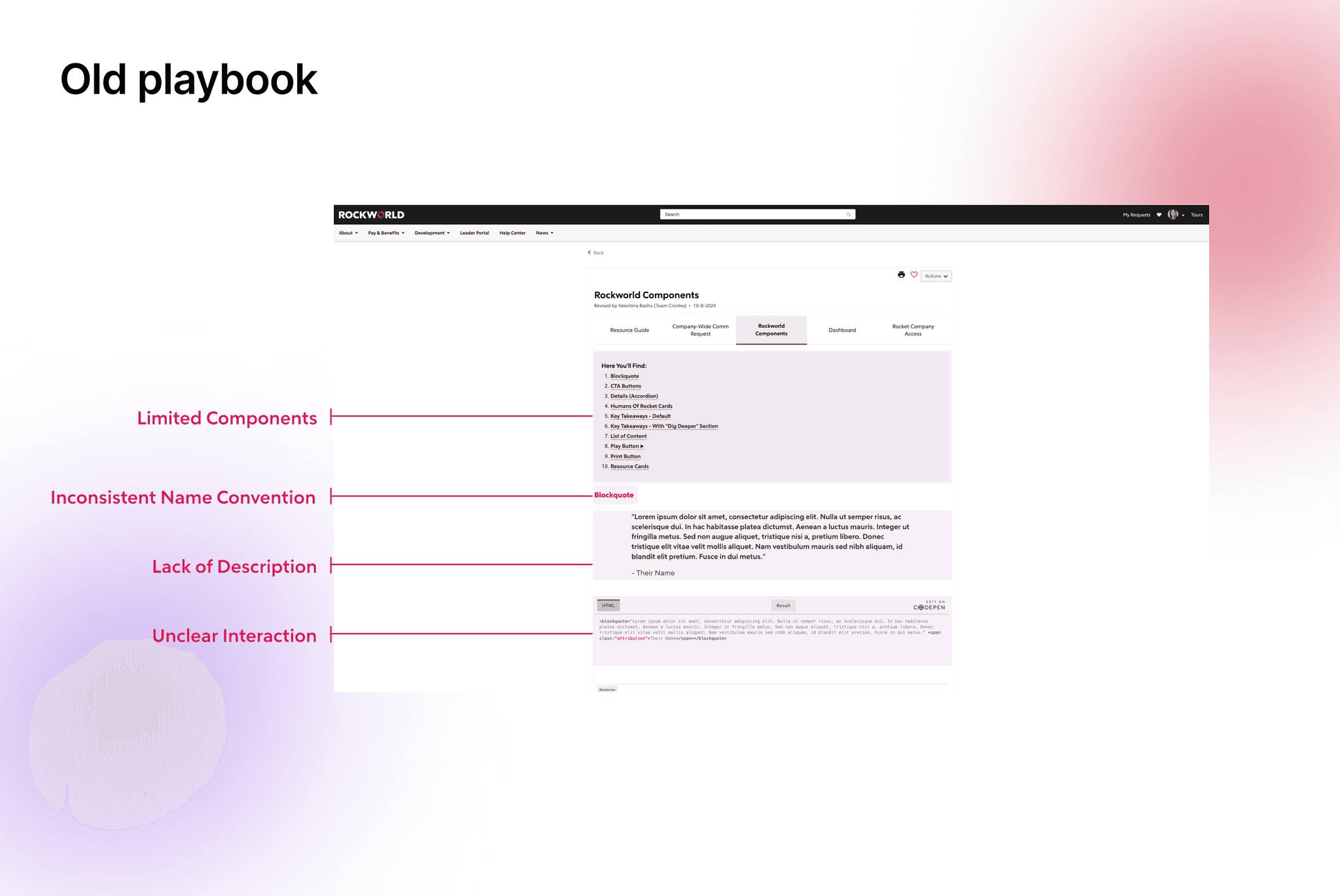
Current Files Lack of Structure and Scalability in the Existing Design Workflow
Current Files Lack of Structure and Scalability in the Existing Design Workflow
PROBLEMS FOUND IN AUDIT
PROBLEMS FOUND IN AUDIT

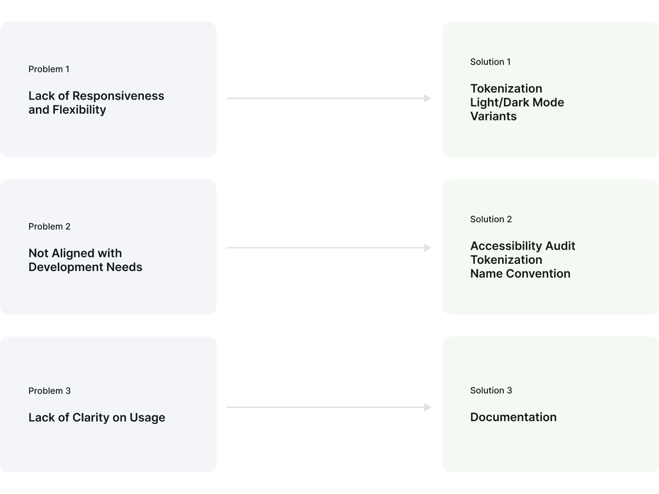
Lack of Responsiveness and Flexibility
Lack of Responsiveness and Flexibility
Users expect components to work well across different screen sizes and devices. Current library lacks responsive elements, it limit the team's ability to create adaptable designs.
Users expect components to work well across different screen sizes and devices. Current library lacks responsive elements, it limit the team's ability to create adaptable designs.
Not Aligned with Development Needs
Not Aligned with Development Needs
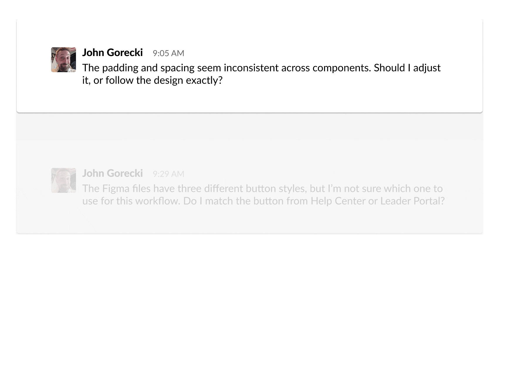
A disconnect between design and development led to implementation issues. Designers didn’t fully understand the technical side, so after finishing the designs in Figma, developers would directly implement from the Figma files with minimal communication. This lack of alignment often led to inconsistencies, especially in naming conventions and other details.
A disconnect between design and development led to implementation issues. Designers didn’t fully understand the technical side, so after finishing the designs in Figma, developers would directly implement from the Figma files with minimal communication. This lack of alignment often led to inconsistencies, especially in naming conventions and other details.
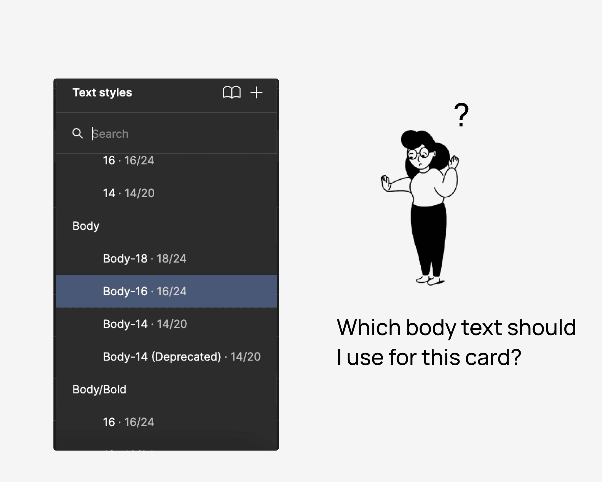
Lack of Clarity on Usage
Lack of Clarity on Usage
Users are unsure which colors or text styles to use in specific scenarios, especially when users just dove in or wear multiple hats, which leading to inconsistencies and incorrect combinations. These issues cause multiple accessibility checks to fail.
Users are unsure which colors or text styles to use in specific scenarios, especially when users just dove in or wear multiple hats, which leading to inconsistencies and incorrect combinations. These issues cause multiple accessibility checks to fail.
Card Component As a Design Process Showcase
Card Component As a Design Process Showcase
After found out the problems during auditing, I focused on applying these principles to one of the most commonly used components: the card. This component exemplified the challenges we faced in the previous design workflow—fragmentation, lack of scalability, and inconsistent implementation—and provided an opportunity to demonstrate the power of the new system.
After found out the problems during auditing, I focused on applying these principles to one of the most commonly used components: the card. This component exemplified the challenges we faced in the previous design workflow—fragmentation, lack of scalability, and inconsistent implementation—and provided an opportunity to demonstrate the power of the new system.
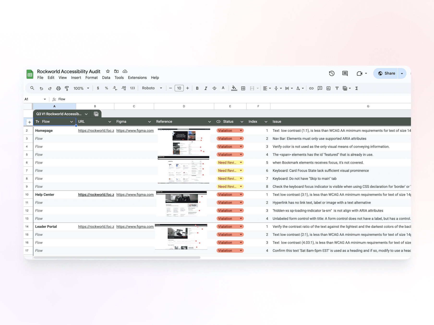
ACCESSIBILITY AUDIT
ACCESSIBILITY AUDIT
Accessibility Audit to Identify Usability Barriers
Accessibility Audit to Identify Usability Barriers
👀 Reason
Rocket Companies values inclusivity, bringing together people from diverse backgrounds.
✅ Audit Methods Used:
Automated Testing → Using tools like Axe, Wave, and IBM Checker to scan for contrast issues and missing semantic HTML.
Manual Testing → Conducting keyboard navigation tests to assess usability for non-mouse users.
🚨 Findings:
Low text contrast, failing WCAG minimum standards, making content difficult to read.
Lack of proper semantic HTML structure, affecting screen reader usability.
Poor keyboard navigation, making interaction difficult for users relying on keyboard controls.
These accessibility gaps reinforced the need for tokenization (to manage contrast and adaptability).
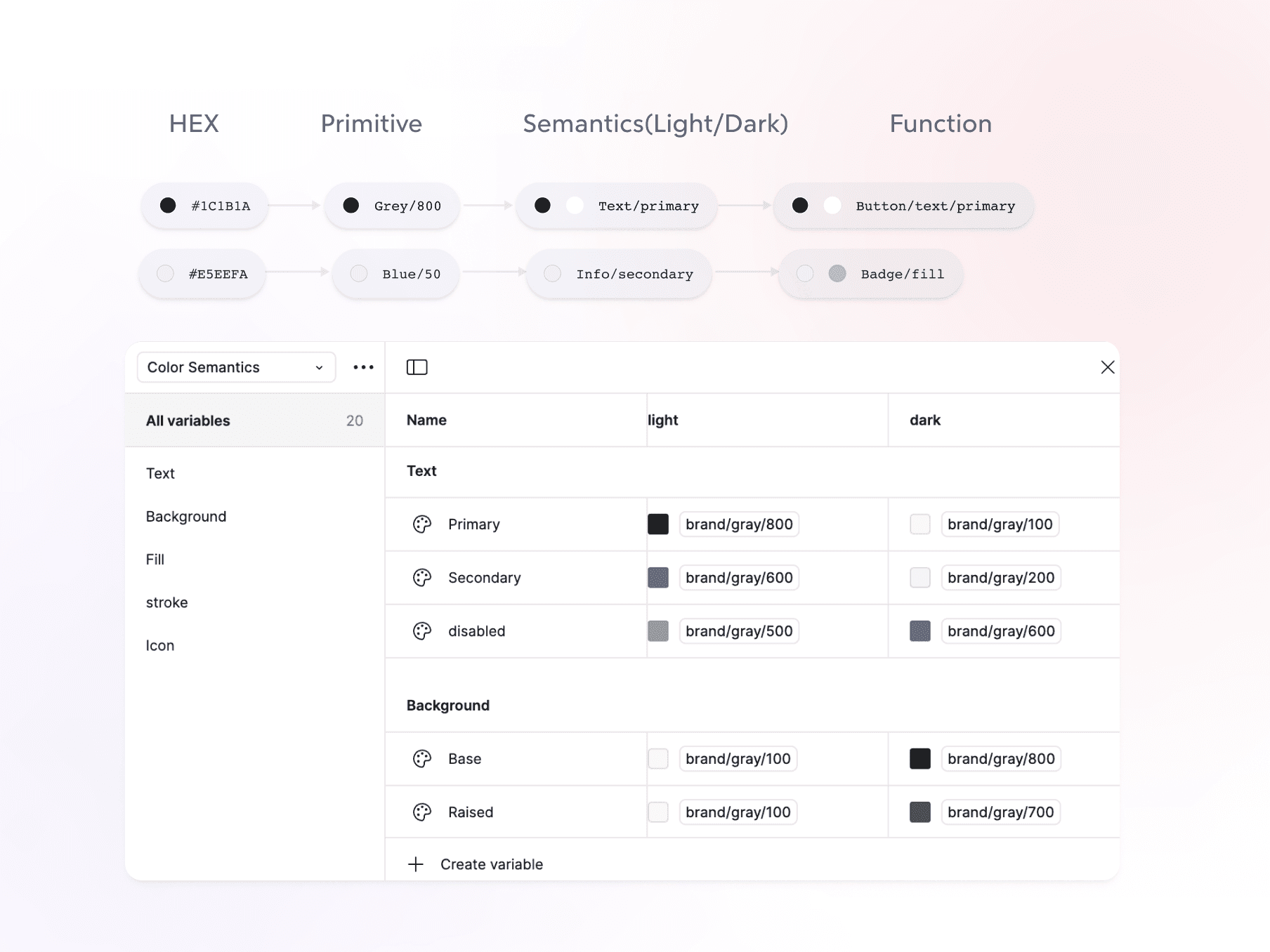
TOKENIZATION
TOKENIZATION
Tokenization to Ensure Responsiveness and Improve Accessibility
Tokenization to Ensure Responsiveness and Improve Accessibility
The audit confirmed that manual style adjustments led to inconsistent accessibility compliance. Without a structured token system, ensuring proper contrast, spacing, and typography across themes was difficult.
The audit confirmed that manual style adjustments led to inconsistent accessibility compliance. Without a structured token system, ensuring proper contrast, spacing, and typography across themes was difficult.

Light/Dark Mode
Light/Dark Mode
Light/Dark Mode to Enhance Adaptability & Accessibility
Light/Dark Mode to Enhance Adaptability & Accessibility
The accessibility audit revealed that contrast issues were more pronounced in dark mode, affecting readability. Additionally, the old system lacked a flexible way to switch themes.
The accessibility audit revealed that contrast issues were more pronounced in dark mode, affecting readability. Additionally, the old system lacked a flexible way to switch themes.
✅ My Solution
✅ My Solution
Theme-aware color tokens, seamless adaptation between light and dark modes.
All text and UI elements met contrast compliance for both themes.
Theme-aware color tokens, seamless adaptation between light and dark modes.
All text and UI elements met contrast compliance for both themes.

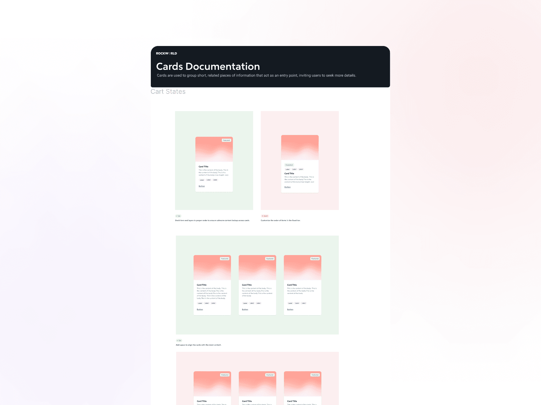
BASE COMPONENTS & VARIANTS
BASE COMPONENTS & VARIANTS
Ensuring Flexibility with Adaptive Variants
Ensuring Flexibility with Adaptive Variants
Beyond Light/Dark Mode, I focused on making the Card Component highly flexible to accommodate different use cases without requiring custom modifications.
Beyond Light/Dark Mode, I focused on making the Card Component highly flexible to accommodate different use cases without requiring custom modifications.

Flexible slots for various needs.
Flexible slots for various needs.
Instant Layout Switching with One Click.
Instant Layout Switching with One Click.

Swap instances with flexible options.
Swap instances with flexible options.
BASE COMPONENTS & VARIANTS
Ensuring Flexibility with Adaptive Variants
Beyond Light/Dark Mode, I focused on making the Card Component highly flexible to accommodate different use cases without requiring custom modifications.
DOCUMENTATION
DOCUMENTATION
From Messy Files to Confident Adoption: Creating a Single Source of Truth
From Messy Files to Confident Adoption: Creating a Single Source of Truth
To address the lack of clarity in component usage, I developed a comprehensive documentation system to guide designers and developers in applying the card component effectively. The documentation includes:
To address the lack of clarity in component usage, I developed a comprehensive documentation system to guide designers and developers in applying the card component effectively. The documentation includes:


Next Steps
Next Steps
Enable a Single Source of Truth Across Design and Code
Enable a Single Source of Truth Across Design and Code
Streamline collaboration across multiple touchpoints, ensuring consistency between designers and engineers.
Develop a Storybook integration, providing a scalable framework for future component development.
Streamline collaboration across multiple touchpoints, ensuring consistency between designers and engineers.
Develop a Storybook integration, providing a scalable framework for future component development.

My Takeaways
My Takeaways
The Hardest Part? Communication and Iteration.
The Hardest Part? Communication and Iteration.
I’m pretty introverted, so in the first three months of my internship, my mentor and leader gave me feedback like, "Serena is sharp and dedicated, but we don’t work alone." This got me thinking: “What does good communication really mean?” So, I started reading Smart, Not Loud: How to Get Noticed at Work for All the Right Reasons and Articulating Design Decisions: Communicate with Stakeholders, Keep Your Sanity, and Deliver the Best User Experience. Through reading, practicing on the job, and learning from my team, I’m slowly figuring out how to make communication work for me. Here’s what I’ve learned:
Design is iterative: Start messy and quick, get feedback, and improve from there.
The hardest part of a design system is getting everyone on board: To do that, you need to know what each person values most and speak to them in their language—not designer jargon.
Get the right help from the right people
Speak up, even if you're not fully ready: There’s no such thing as a “stupid idea.” Just putting your thoughts out there can be valuable.
Communication isn’t just about talking: It’s about expressing yourself through body language, reading the room, and knowing when and how to engage.

More projects

CHALLENGE 02
Lack of a Scalable Framework for Internal Use
HOW I DEAL WITH THIS SITUATION
Step By Step: How I Overcame Design System Scalability Challenges
1
Design Audit (Component Audit & Accessibility Audit)
Audited the component library for inconsistencies and conducted an accessibility evaluation (WCAG) to uncover usability barriers.
2
Systematization → Tokens & Variants
Defined design tokens for light/dark mode and standardized variants, states, and interactions for scalability.
3
Documentation → A Single Source of Truth
Created Figma documentation with variants, usage guidelines, and interactive states to align designers and developers.
CURRENT FILES AUDIT
Current Files Lack of Structure and Scalability in the Existing Design Workflow
PROBLEMS FOUND IN AUDIT
Lack of Responsiveness and Flexibility
Users expect components to work well across different screen sizes and devices. Current library lacks responsive elements, it limit the team's ability to create adaptable designs.
Not Aligned with Development Needs
A disconnect between design and development led to implementation issues. Designers didn’t fully understand the technical side, so after finishing the designs in Figma, developers would directly implement from the Figma files with minimal communication. This lack of alignment often led to inconsistencies, especially in naming conventions and other details.
Lack of Clarity on Usage
Users are unsure which colors or text styles to use in specific scenarios, especially when users just dove in or wear multiple hats, which leading to inconsistencies and incorrect combinations. These issues cause multiple accessibility checks to fail.