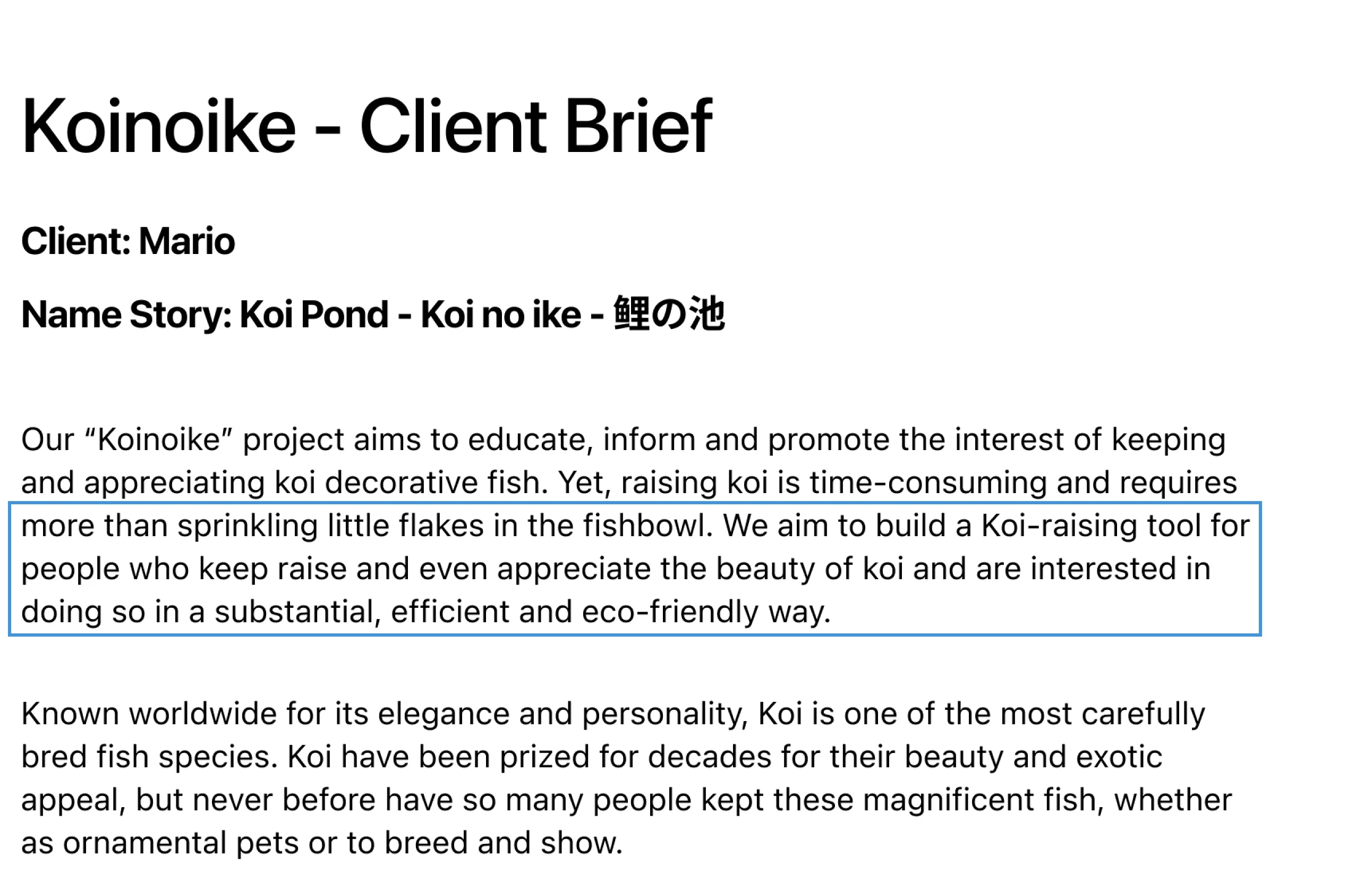

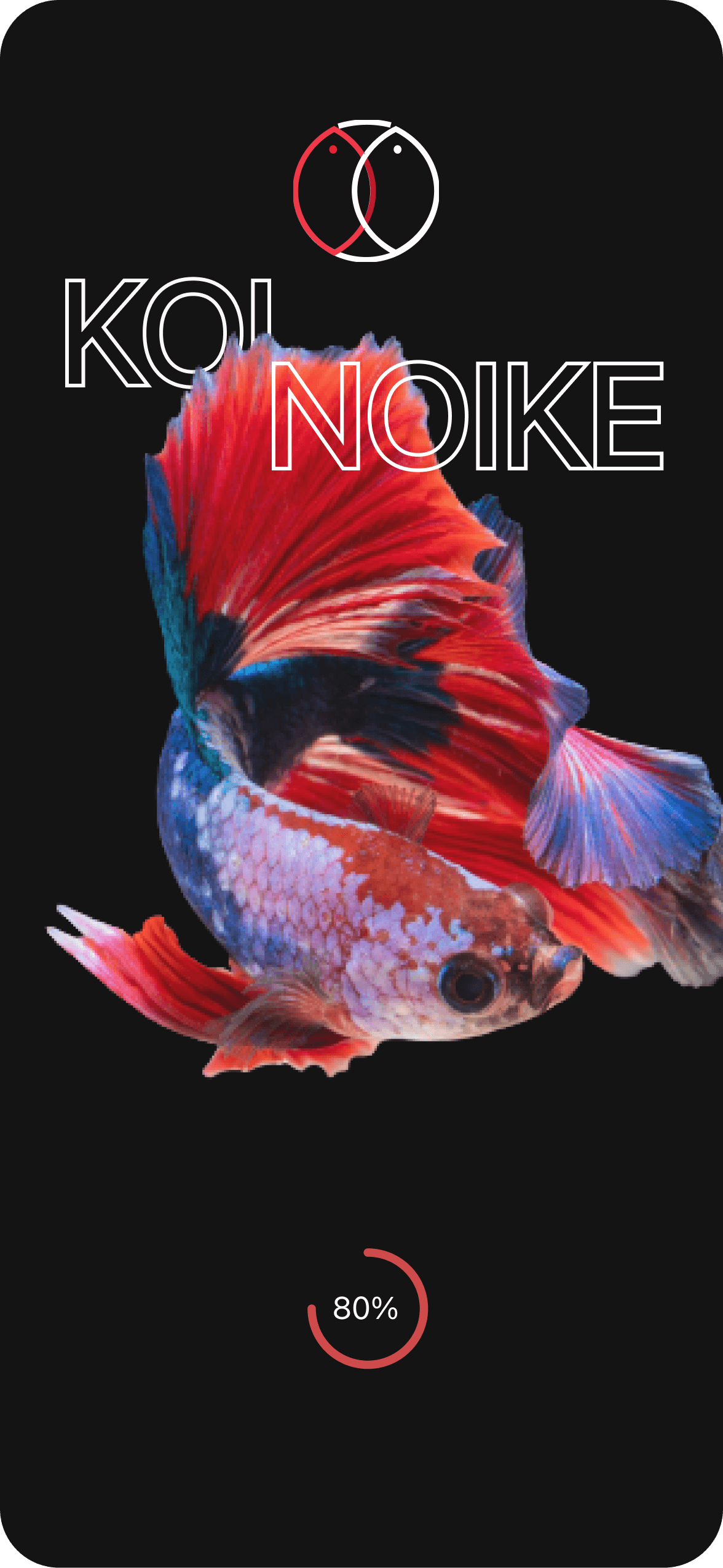
Koi-Raising
Tool

Time-Saving
Tool

User-Friendly
Tool
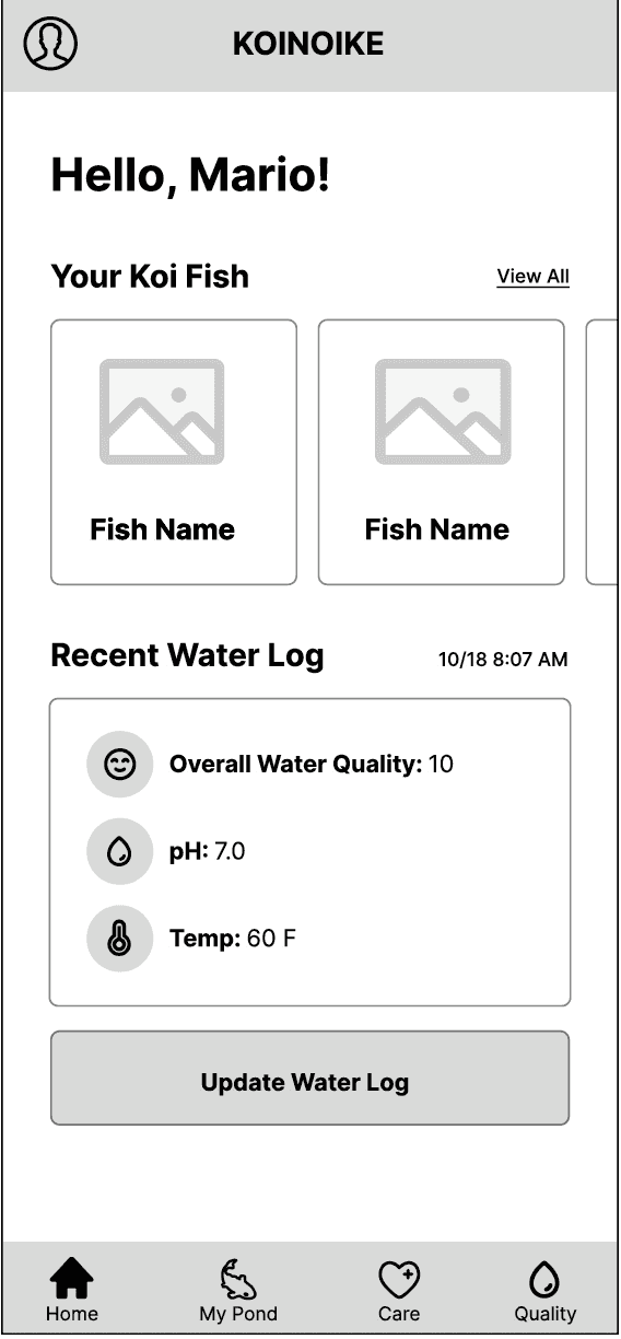
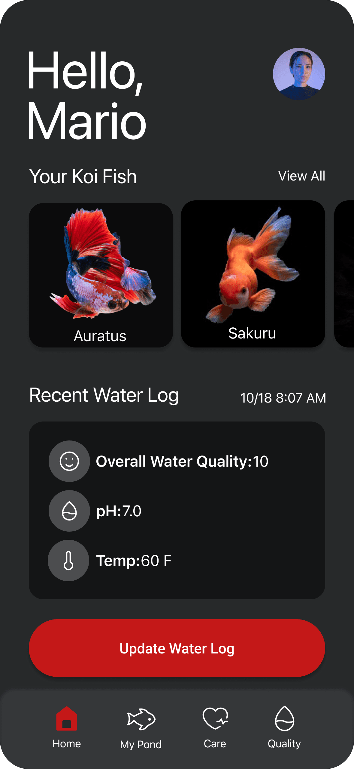
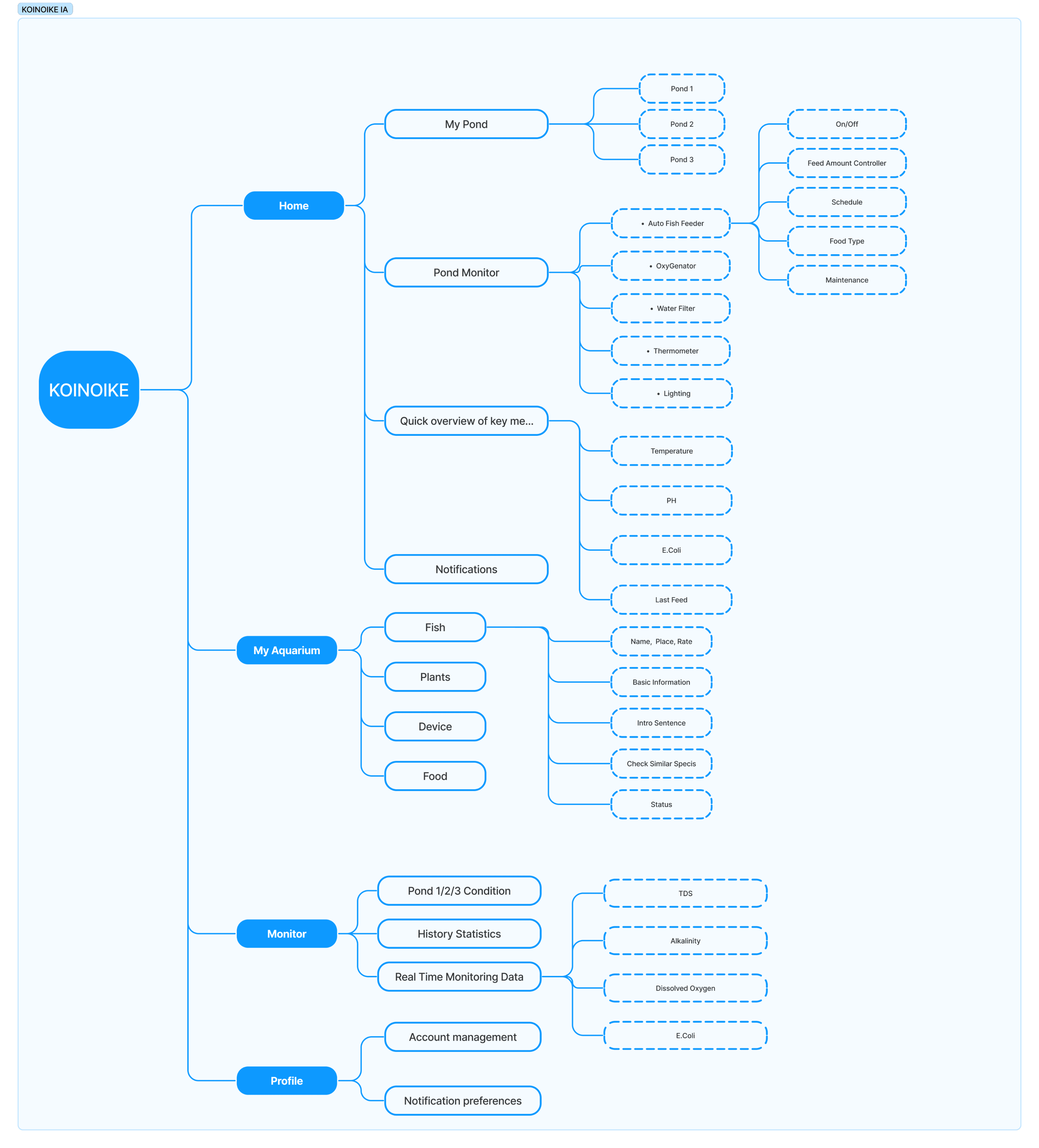
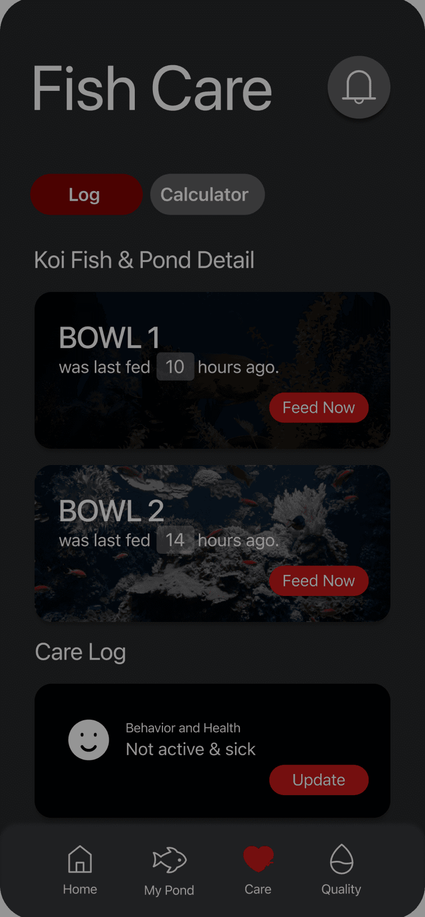
Dashboard
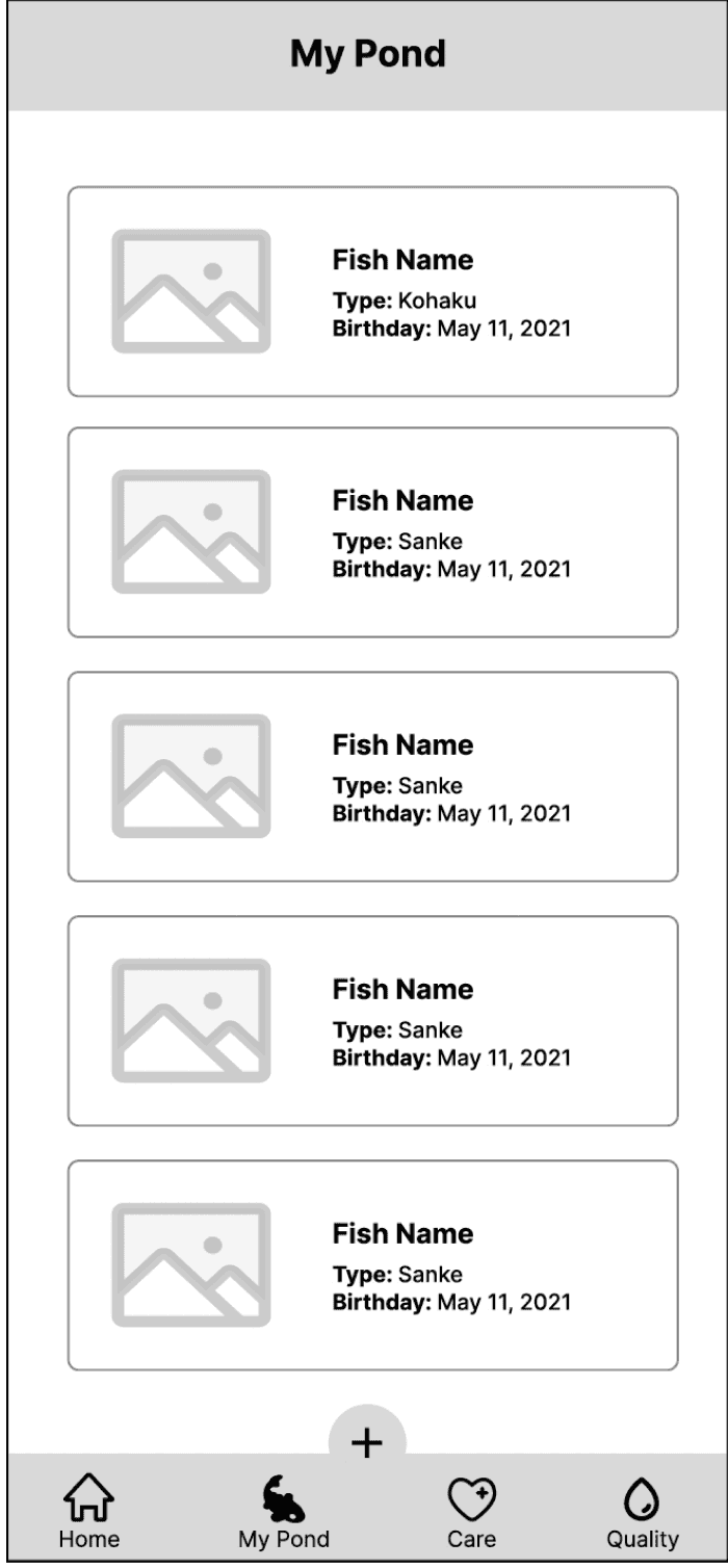
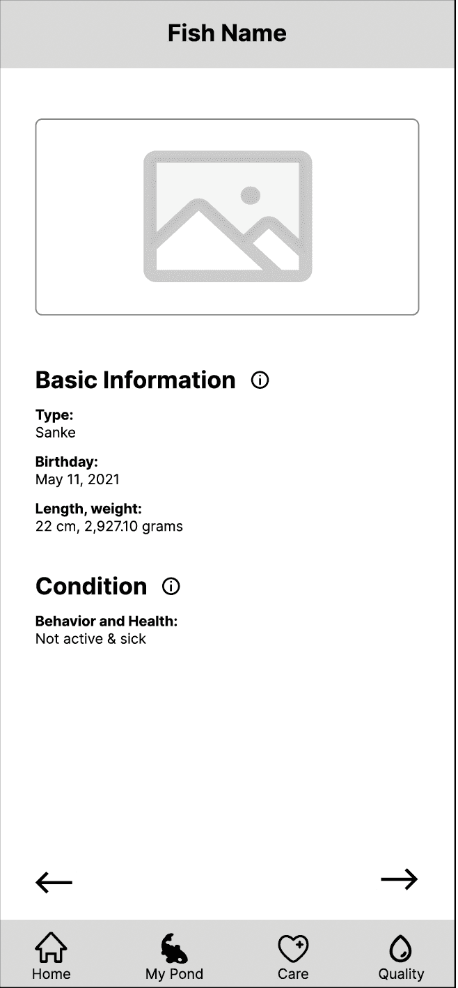
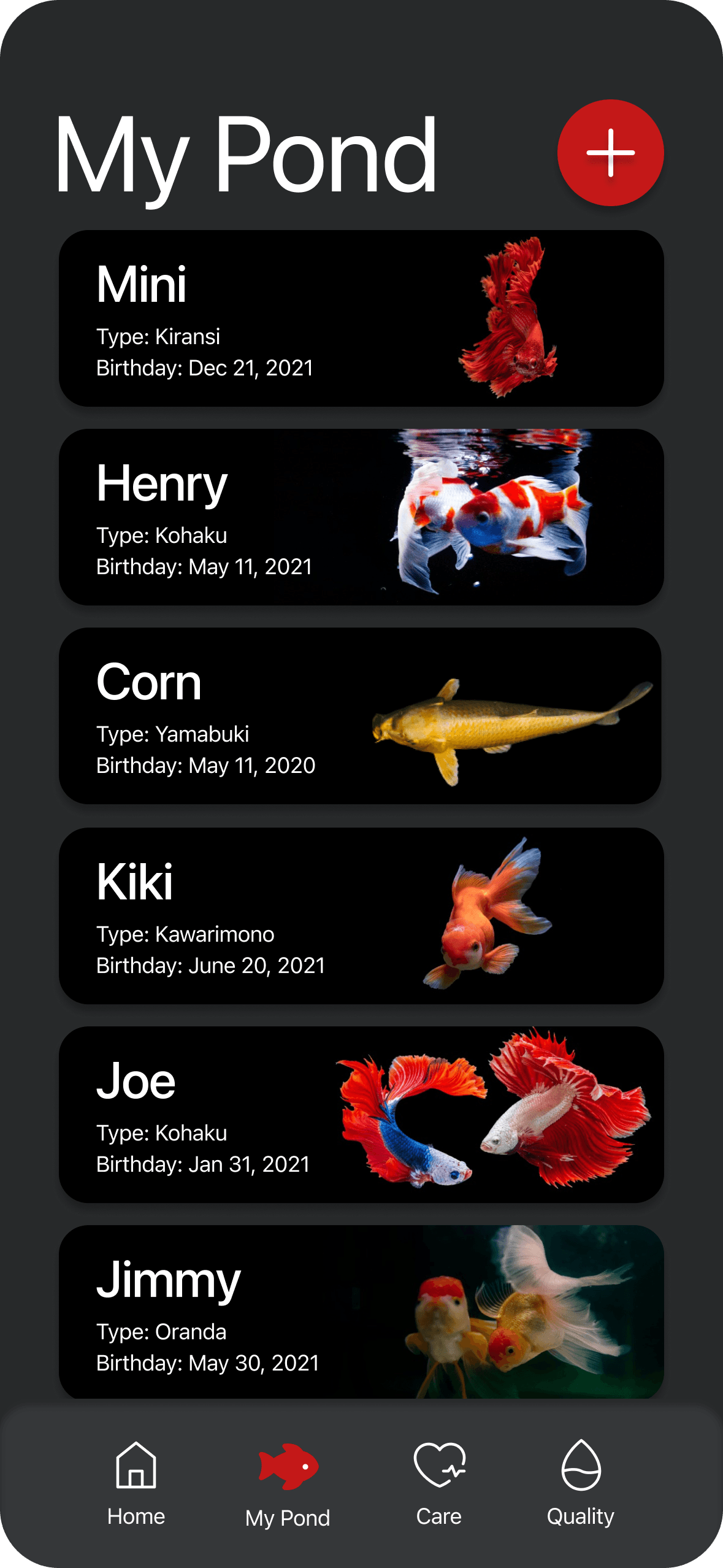
Fish List
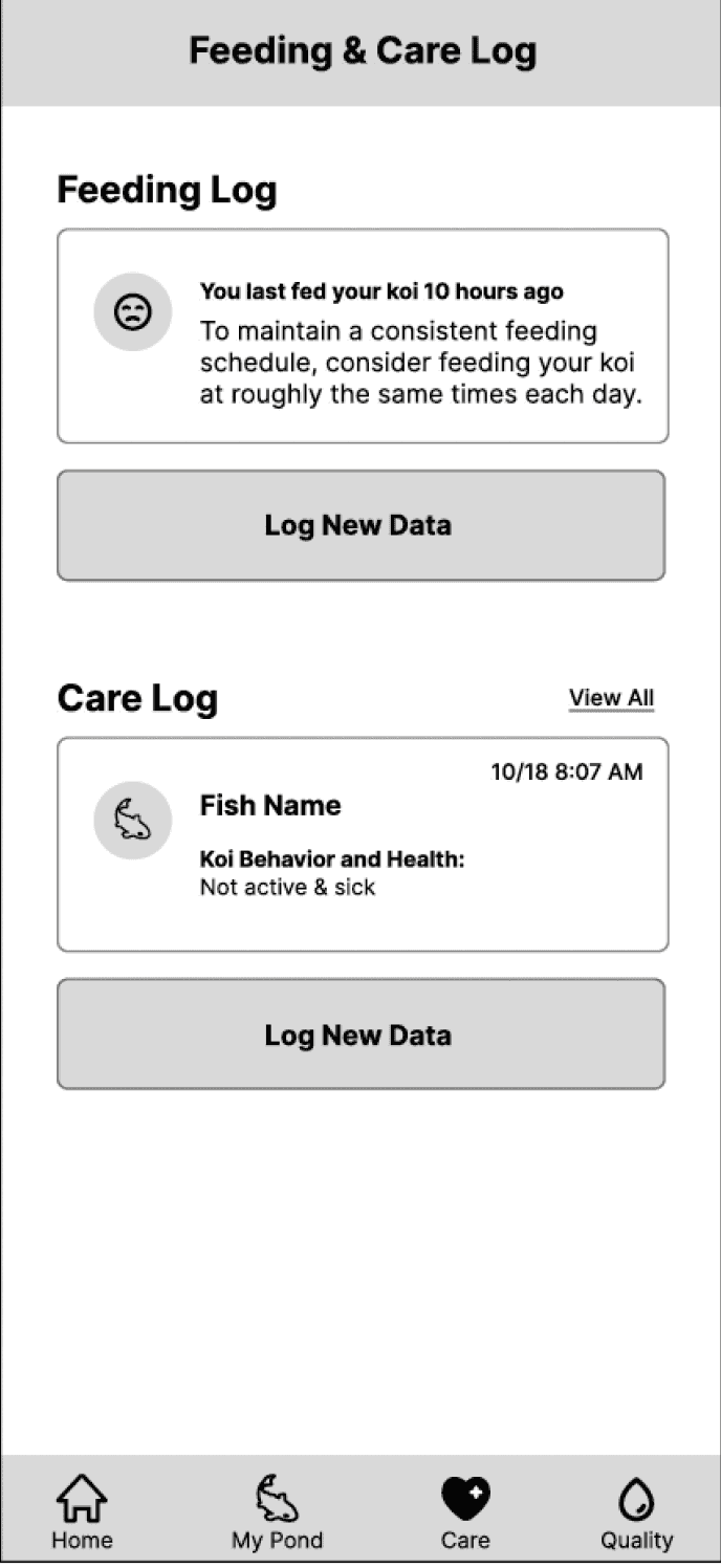
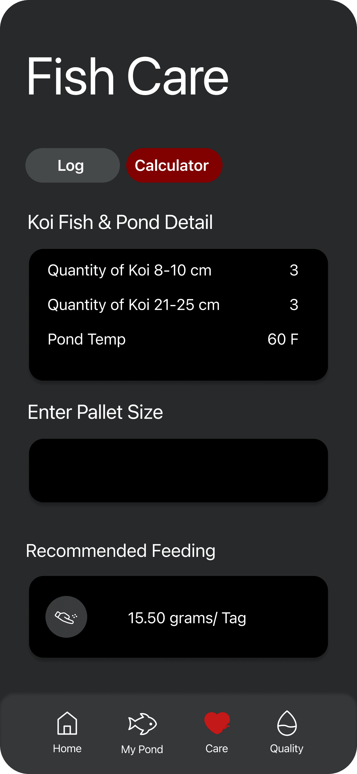
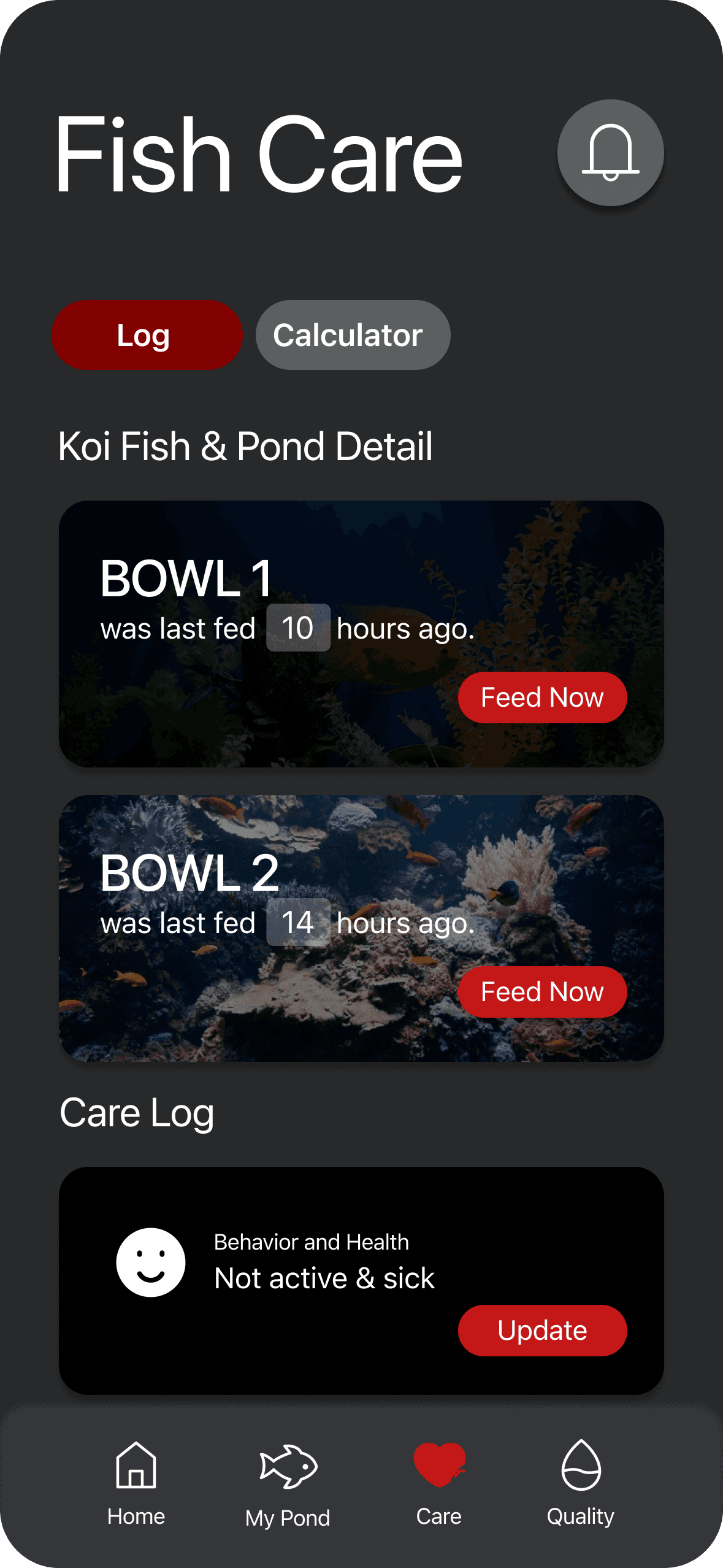
Feeding & Care
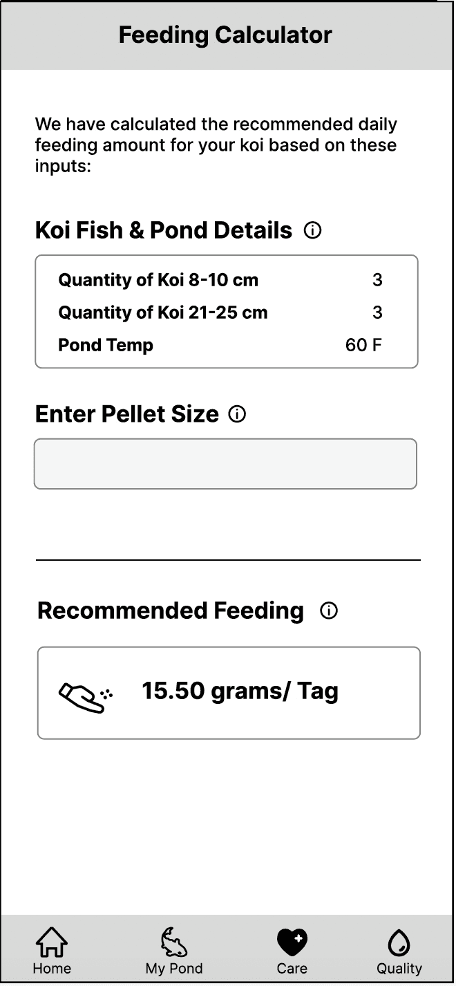
Fish Feed
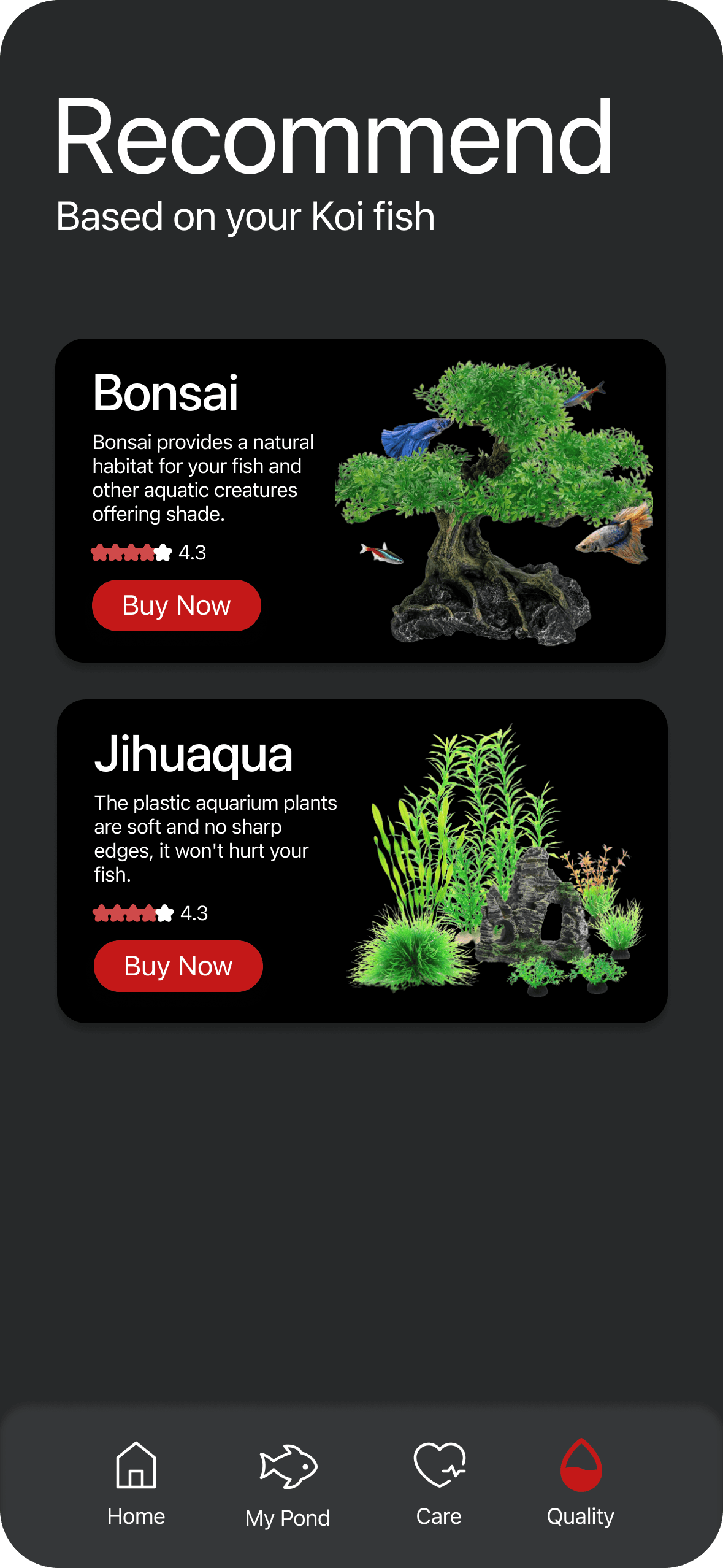
Fish List
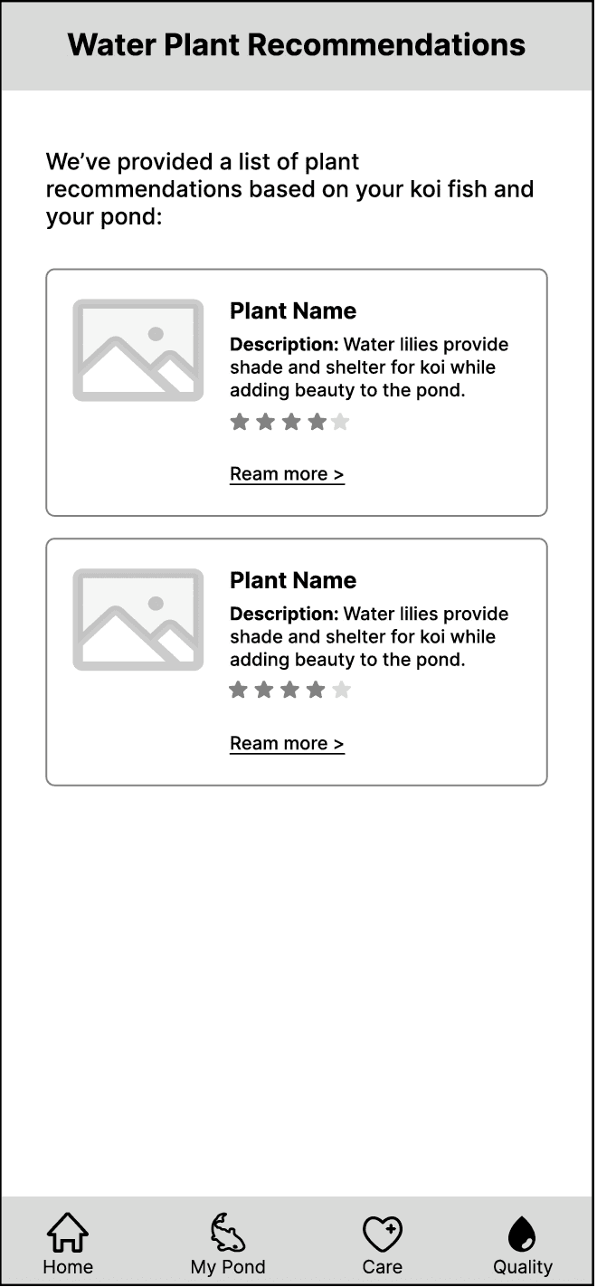
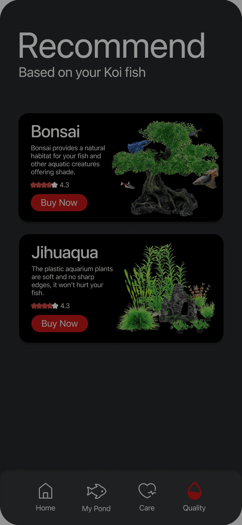
Recommend plants

OLD
NEW


AquaLife Hub
Combining fish lists with recommended aquatic plants in one spot.
OLD
NEW
AquaGrowth Wikipedia
One-click access to track the growth status of any aquatic life.

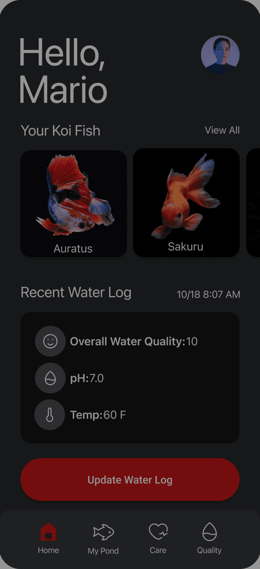
Color Scheme Update: Transition from the current red theme to a more tranquil, water-inspired blue hue. This change aims to evoke a sense of calm and affinity with aquatic environments, enhancing the overall user experience.
Red is Koi-related, but also represents error or danger in western world.
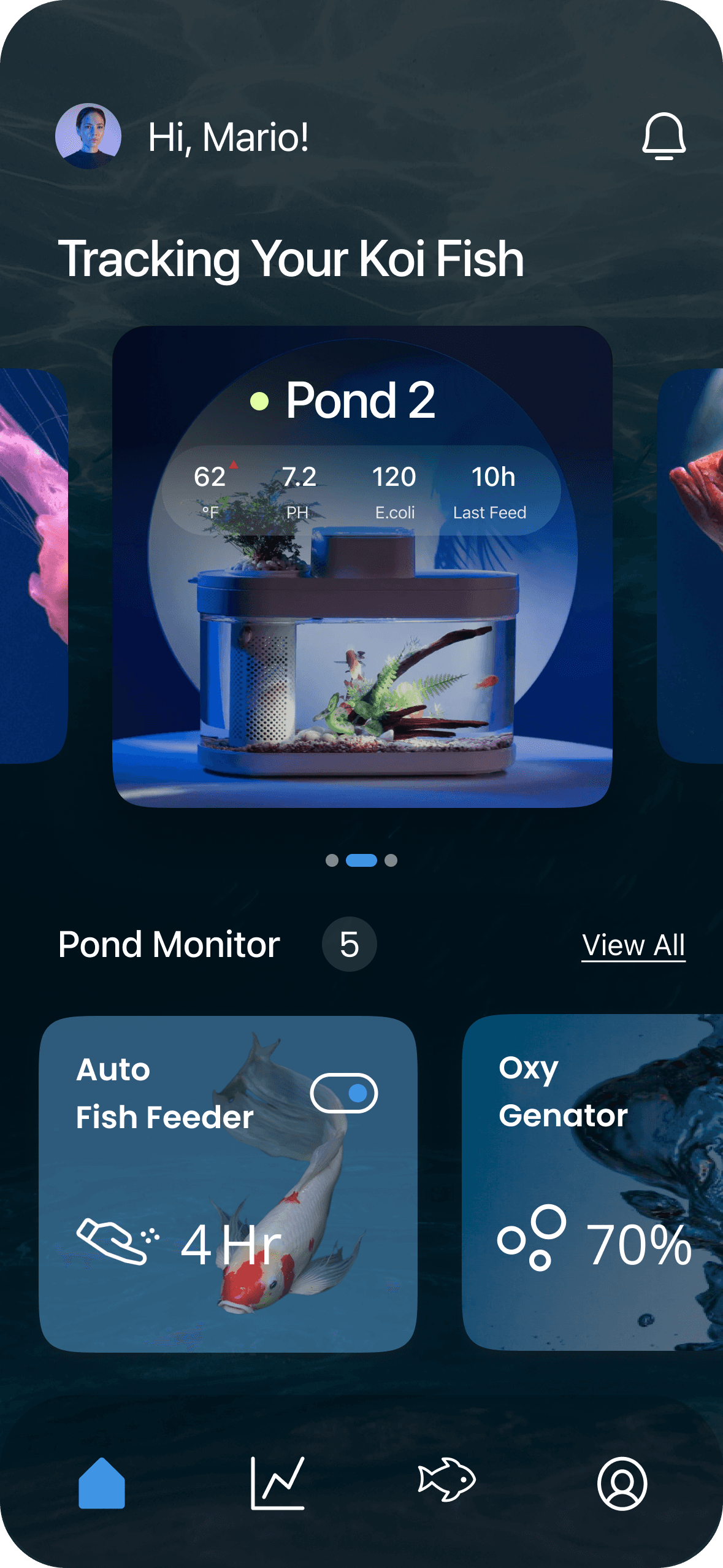
Blue, creating a thematic connection to the aquatic environment of koi fish
#CF4A4A
#3F94E3
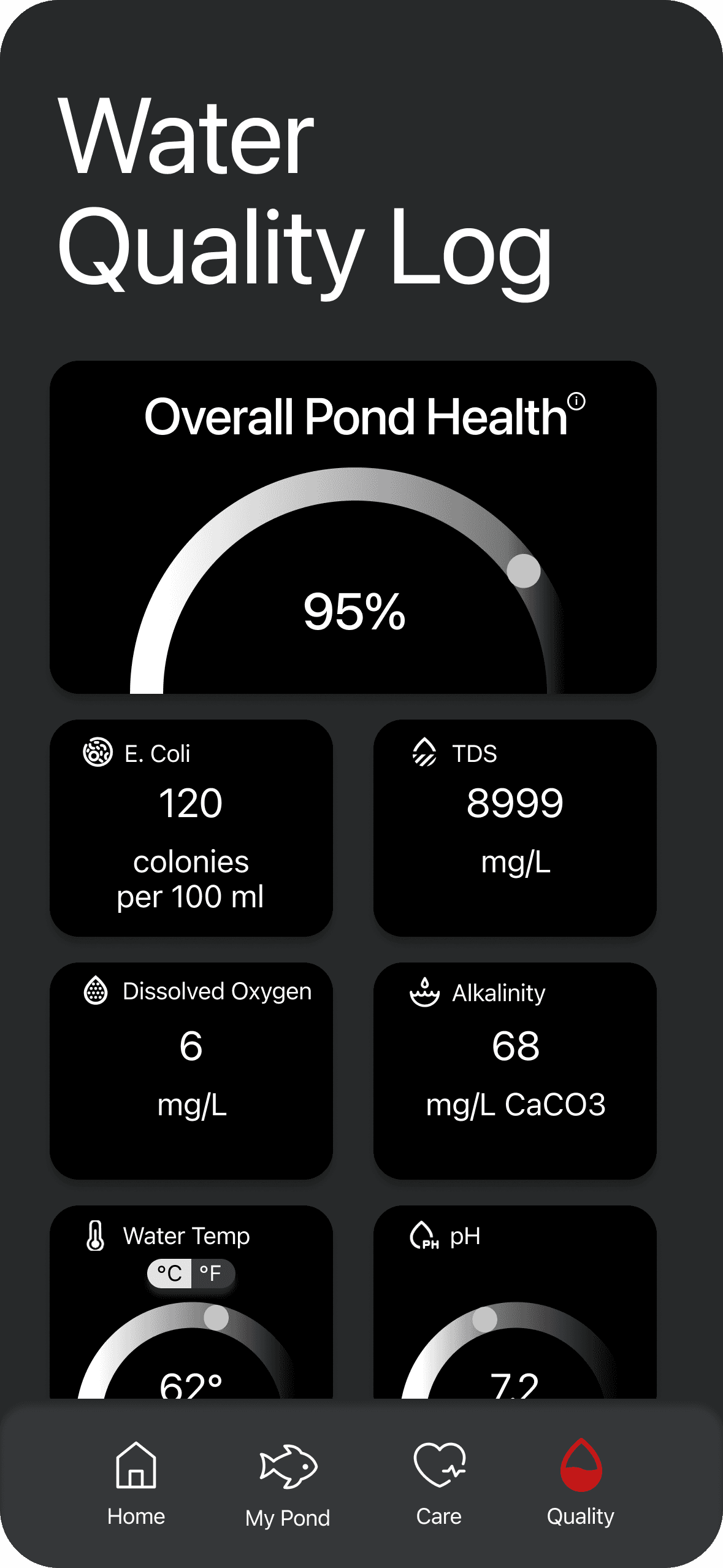
Visual Hierarchy Optimization: Implement refined visual modifications to emphasize key information on each page. This involves strategically utilizing design elements to draw user attention to the most critical data and features, ensuring a seamless and intuitive navigation experience."
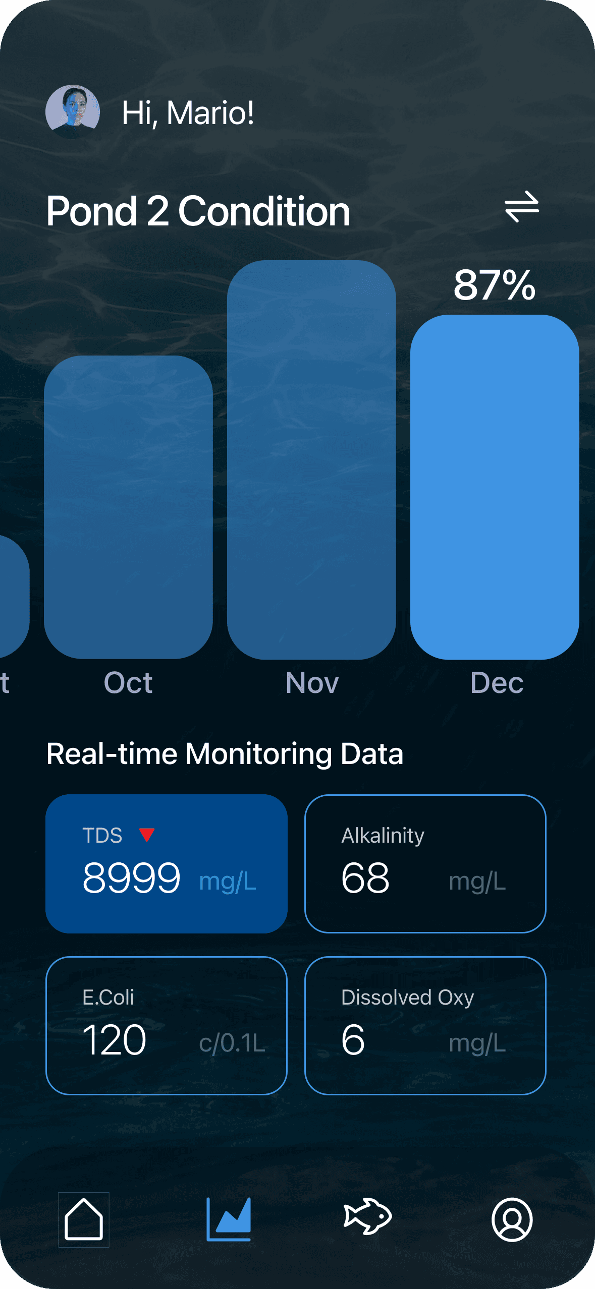
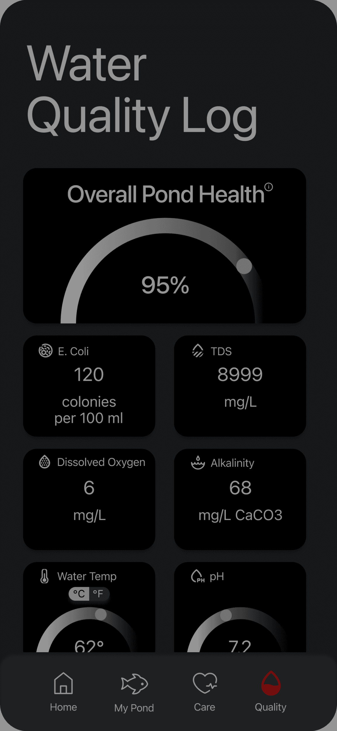
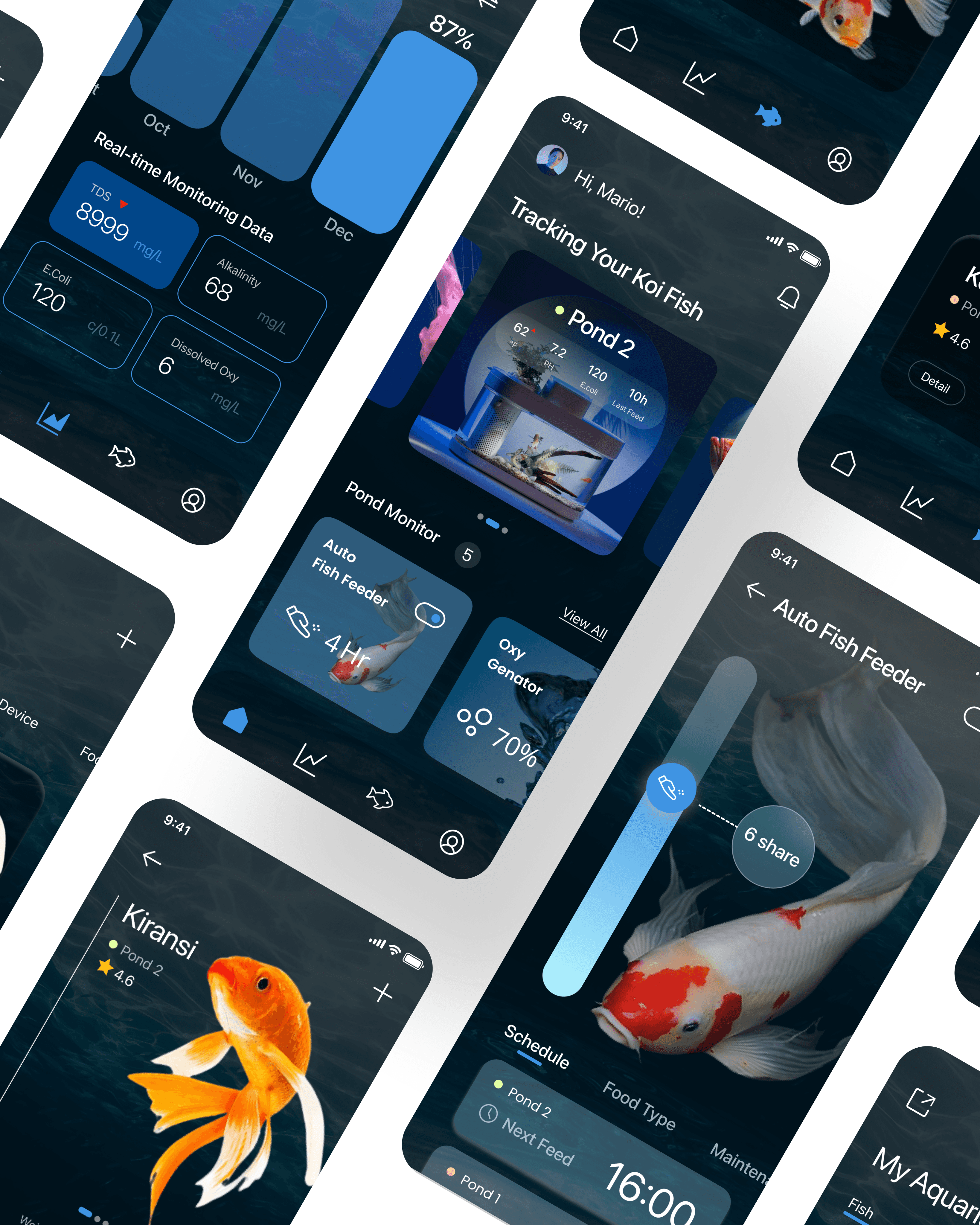
TDS
8999
mg/L
E.Coli
120
c/0.1L
Alkalinity
68
mg/L
Dissolved Oxy
6
mg/L

Large Title
Title 1
Title 2
Title 3
Headline
Body
Subhead
Aa
SF Pro
A clean design and excellent legibility across a wide range of devices.


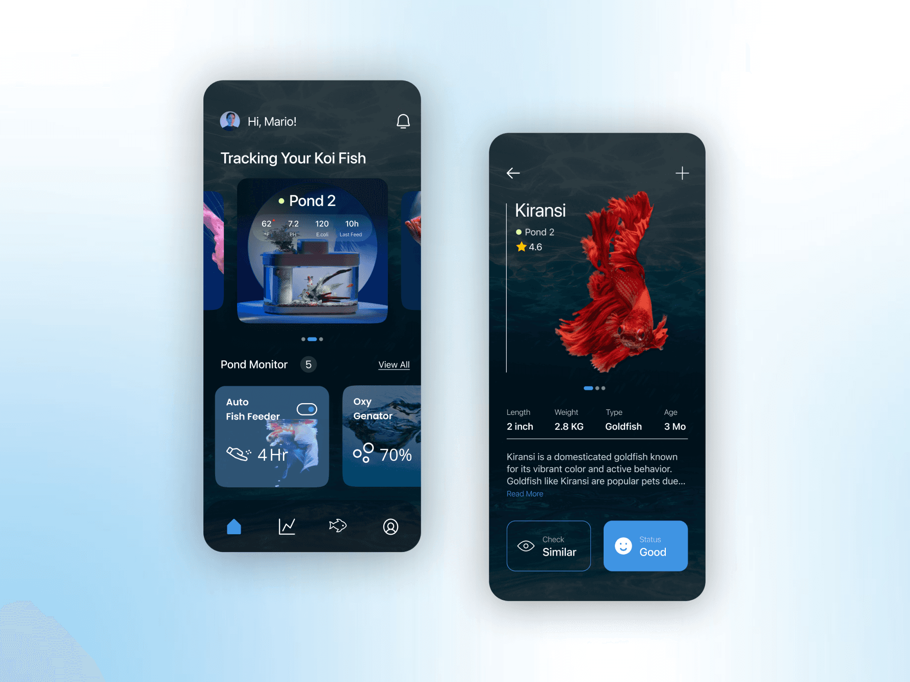
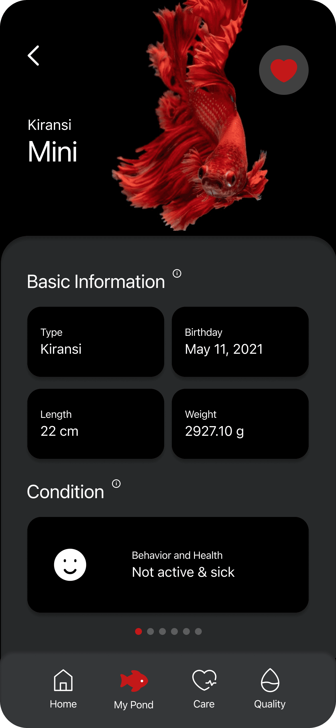
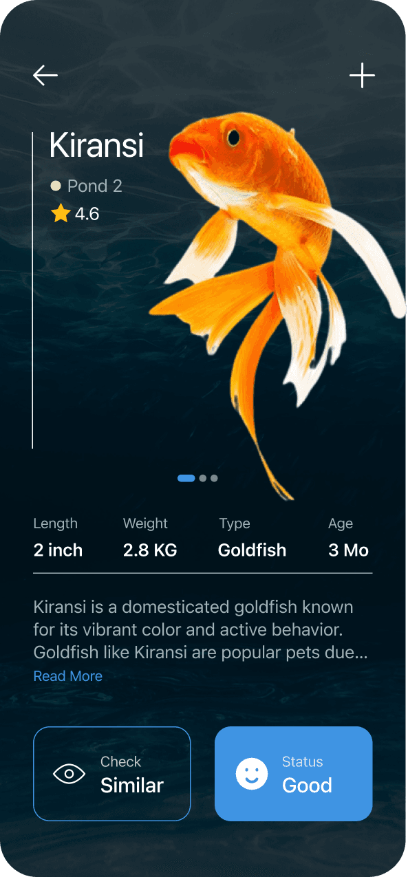
Kiransi
Pond 2
Detail
4.6

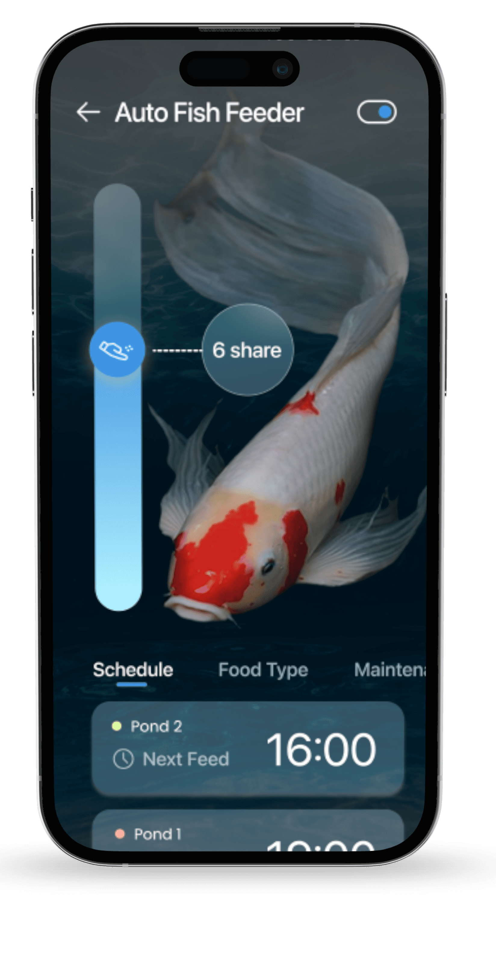
Pond 2
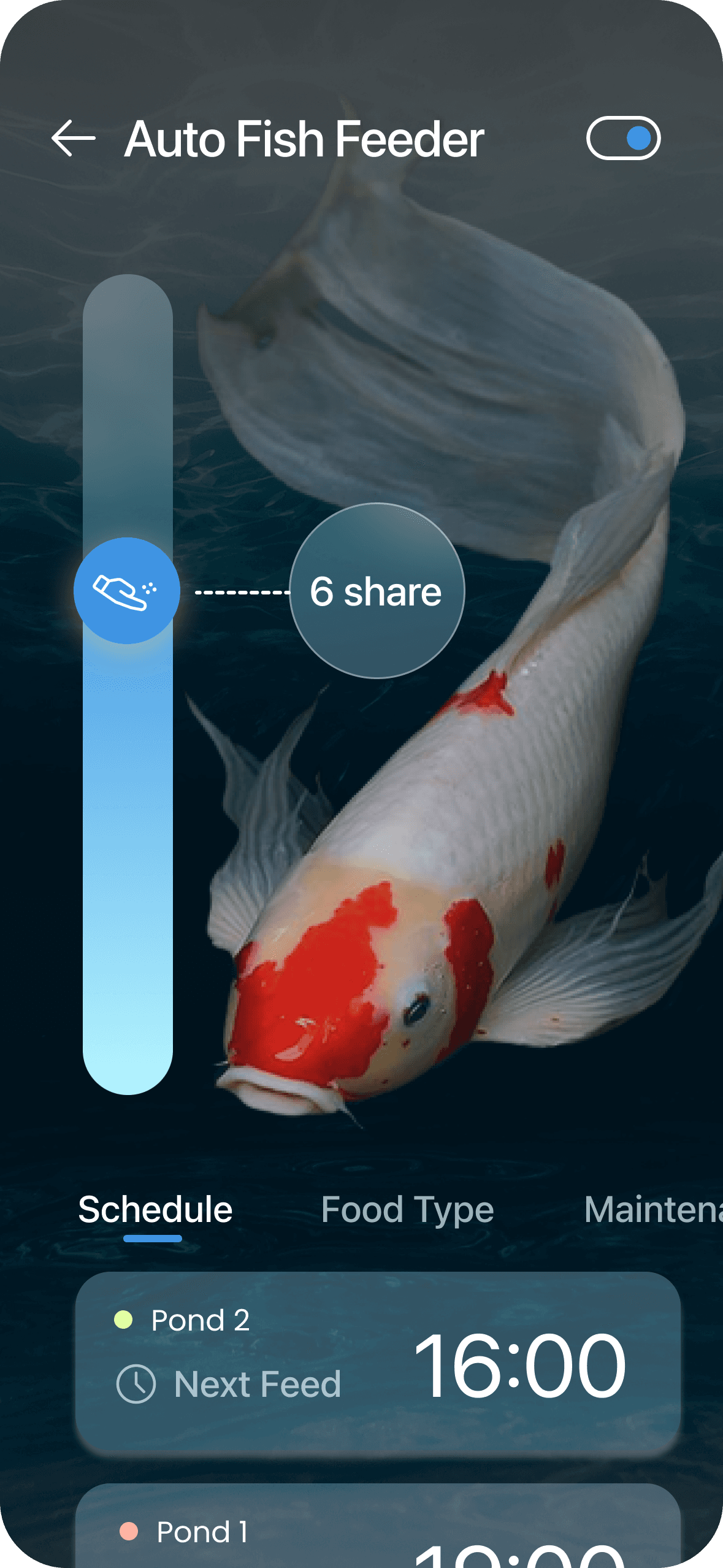
16:00
Next Feed

Alkalinity
68
mg/L
Hi, Mario!


62
7.2
120
10h
℉
PH
E.coli
Last Feed

Auto
Fish Feeder
4
Hr

Figma
Chatgpt (for cover smart fish tank)
Adobe Photoshop
Takeaway
UI design goes beyond making good-looking apps; it involves improving upon wireframes.
Always design thoughtfully, highlighting the most important elements prominently.
Structure data visualizations hierarchically to emphasize key information. Clearly indicate primary and secondary data points, guiding viewers on subsequent actions.